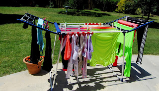
What does laundry have to do with choosing color palates? Well, pictures speak louder than words.
This is my laundry. Bright and colorful. If I were to choose one of these groupings for a quilt, it would have to be this bright picture. But what if one of these bright colors ended up in the first photo, would it be a bad thing? It would certainly stand out, however it would add a lot of interest and unexpected pop to the grays and blues.
I have picked up a book in my library entitled, "Color Play second edition" by Joen Wolfrom. In my opinion, she is a master teacher of color in textile media.
I attended one of her classes almost 20 years ago and it helped me make choices in grouping colors together to make interesting quilts.
Currently, I am working on tile quilt blocks. The blocks are 15" and appliqued with petal shapes.
The blocks will be random in their color ranges, so even though they may have other colors included in the cut petal shape, they will read as the overall color of each block.
So far, I have 5 made with 11 to go. I am using the fusible adhesive product, Steam-a-Seam 2, for the applique shapes. On the reverse of my back ground, I am using Totally Stable stabilizer which is also fusible, but more of a temporary hold. Sewing through all these adhesives gums up the needle quite a bit and I'm finding it frustrating.
I will have to double up on the color blocks to make the 16 blocks. This will work out to 4 block by 4 blocks square and measure 80"X80" when finished.
Working on this quilt will keep me busy and out of the extreme heat of the summer months.


.jpg)
No comments:
Post a Comment